Lemme tell you.
The two things asked of this project were that it would be portraiture and done in colour instead of black and white, which we've been doing for the three previous assignments. From the very beginning I felt that I wanted to cling strongly to the colour aspect of the briefing and use it as a vital element in the images rather than just treating it as a technical demand from the course leaders.
As colour holds an overwhelming amount of meanings and interpretations, it felt natural to start by reading about different colour theories. I found a perfect book for my needs from our precious library and got on studying philosophy and psychology of colours - understanding about one third of all that I read.
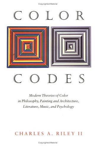 |
| yeah, dis be ze cover of ze book |
A lot of this seems to me a bit too feeble to be reliable, but is nonetheless interesting in a way. And don't get me wrong, colour theories are mostly based on scientific-sort-of research. This research though, relies on psychoanalysis and the notion of the unconscious, so if you're not a fan of Freud and the friends you're probably not a fan of colour theories either.
People respond to different colours in different ways and cultural heritage has a defining role in associating colours with feelings for instance (in Western societies black is traditionally the colour of mourning, whilst in Asian countries that title is held by white). Whether or not one's personal qualities can be deduced through colour tests is another question as is the effectiveness of colour therapy, which basically is a treatment using certain colours to provoke certain emotional and physical responses in the patient. It's all rather foggy and dodgy in terms of straight, scientifically proven facts but I find all of this mysticism around colour symbolism kind of fascinating because after all colour does have quite an important role both in our personal lives and globally.
So I took some colour tests that promised to give me an accurate description of my personality and my current emotional state. In major part they hit the nerve but like Internet horoscopes, these descriptions are so vague and interpretable that one automatically reads them to fit their own situation ignoring the bits that don't quite make sense to them.
Anyway, here are three different tests that claim to have a reliable scientific background.
Colorgenics
ColorQuiz
Test Color
Go and see for yourself to form an opinion.
Then, at some point I decided to paint my face with fingerpaint.
 |
| What an ugly yellow colour cast we have here. |
Looks like a mentally deprived person just found the hospital's art supplies and went wild.
But it was much, much fun and I like the substance-ness of the paint - if you look closely you can see how it's thicker on some parts and thinner on others. I also like how the facial features almost disappear under the layers of colour.
After this experimentation I got convinced that face painting was definitely going to be my way of bringing colour as a central element into the project.
I read a little about a Hindu festival where colour is in a major role of the festivities, and how it brings people from different social levels down together to celebrate.
I also studied tribal face painting traditions, and learned that in their tradition body and face painting have multiple meanings, and that different colours and patterns symbolise different social status, age or religious ritual.
Of course, face painting has also been used as a camouflage or to frighten the enemy at war. And in Africa and Australia where the midday sun is quite a grill, a layer of paint protects the skin from burning.
 |
| Face fashion from America, Australia and Africa. |
Or maybe they do want us to do our faces like this. I don't know.
 |
| raaahhh, I'm a wild beast |
 |
| I can't actually move my face muscles cos of these layers of foundation and stuff. |
And the we have Lady Gaga of course.
 |
| Can't read my painted face. |
But in my project the models were free to choose their colours and what they wanted to do with them. I didn't control the process at all, just laid out my fingerpaints and a mirror and told them not to make too much mess. Then I sat them down on a chair before my camera without a shirt to center the viewer's attention only on the face and its colours. I asked my sitters to have a neutral, non-emotional expression and to look straight through the camera.
I don't know what I expected but I'm really happy with the results so far.
First of all, it was absolutely fascinating to see how differently - and yet similarly people reacted to the task. I also didn't expect a distinct difference between genders, but it's there: while most of the guys didn't really have a plan but just sank their fingers into the paint and smudged it all over their faces, girls tended to draw dots and stripes and create these harmonious and geometrical paintings. Since my approach had been quite impulsive even though I'm a woman, I didn't expect to see anything as clear as I did.
Interesting, fascinating, exhilarating. And in the end, quite touching as well - like my one of my tutors noted in a seminar a couple of weeks ago. There really is something that seizes me when I look at the finished images. With the silly looking colour mask, unemotional face and the brightness of the background my models look even spiritual. I can't quite put my finger on it but somehow they move me.
And I have no idea of what I'm going to call this body of work.


